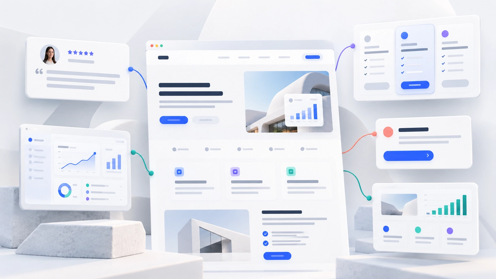

Most B2B SaaS websites fail in one of three places. The structure does not match how buyers actually evaluate software, the proof is too vague to believe, or the conversion path asks every visitor for the same commitment regardless of how ready they are. Fix those three and most of the other problems become smaller.
Key Takeaways
- Every page should have one clear job, and the site structure should mirror how buyers move from problem to evaluation to decision.
- The homepage has seconds to answer what the product does, who it is for and why anyone should believe it.
- Specific proof beats impressive proof: named customers, concrete outcomes and real product UI outperform vague superlatives.
- Conversion paths should match readiness, offering something useful to the visitor who is not ready to book a demo.
- Performance, accessibility and maintainability are conversion issues, not technical housekeeping.
Ask a B2B SaaS team what their website is for and you will usually hear "generating demos". Ask them what each page is for and the answers get vague quickly. That gap is where most underperforming sites come from. Pages exist because someone once needed them, proof is scattered wherever it happened to fit, and every call to action points at the same demo form regardless of whether the reader arrived five seconds ago or has been evaluating you for a month.
None of what follows is exotic. It is a set of practices that sound obvious and are rarely applied consistently. They fall into three groups: how the site is structured, how it earns belief, and how it turns interest into action.
Give every page one job
The single most useful discipline in B2B website work is being able to state, in one sentence, what each page is supposed to achieve. Not what it contains. What it is for.
A product page exists to explain how the product works and convince an evaluator it fits. A use-case page exists to show a specific type of buyer that you understand their problem. A pricing page exists to answer the cost question honestly enough that the reader keeps going. A customer story exists to prove that someone like the reader got a result. When a page tries to do all of these at once, it does none of them well, and the reader leaves without knowing what the next step was meant to be.
This also gives you a clean way to audit an existing site. Go through each page and write its job in a sentence. Pages where you cannot do it are candidates for merging, rewriting or removing. Pages where two share the same job are likely competing with each other, both for the reader's attention and in search results.
Structure the site around how buyers evaluate
B2B buying is rarely linear, but it does have a shape. Someone becomes aware of a problem, looks at approaches to solving it, compares specific vendors, and then tries to reduce the risk of choosing wrongly. A good site has a place for each of those moments.
In practice that usually means a small set of page types doing distinct work: product and feature pages for how it works, use-case and industry pages for who it is for, integration pages for how it fits the existing stack, customer stories for proof, a pricing page for cost, security and trust content for the people whose job is to say no, and resources for the earlier, problem-aware reader. Navigation should make those groups obvious, not bury them under clever labels. A buyer looking for your security documentation should not have to guess that it lives under "Company".
The structure has to survive growth, which is where most sites break. New pages get added by different people in different quarters, and within two years the site looks like four companies. The fix is treating page types as templates within a system rather than one-off builds, which is the core of how we approach web design for SaaS teams. Structured Webflow CMS collections make this practical for customer stories, integrations and resources, because each new entry inherits the layout and linking decisions made once. Clear, crawlable structure also matters for search, and Google's Search Central documentation is the authoritative reference on how that works.
Build the homepage around the first three questions
Every visitor to a B2B SaaS homepage is trying to answer three questions, usually within the first scroll. What does this actually do? Is it for someone like me? Why should I believe it?
The first question is where most homepages go wrong. Category-creating products especially tend to open with an abstract promise rather than a concrete description, because the team is close to the vision and has stopped noticing that a stranger cannot decode it. A useful test: show the hero section to someone outside the company for five seconds and ask them to describe what the product does. If they cannot, the headline is doing positioning work when it should be doing explanation work.
The second question is answered by naming the audience directly, either in the subhead or through visible routes for different buyer types. The third is answered by putting credible proof close to the top rather than saving it for the bottom of the page, where many readers never arrive.
A strong homepage also resists the urge to say everything. It is a routing page as much as a persuasion page. Its job is to confirm the visitor is in the right place and send them to the page that answers their specific question, not to reproduce the whole site in a single scroll.
Make proof specific enough to believe
B2B buyers have seen every superlative. "Trusted by leading companies", "the most powerful platform", "loved by teams everywhere": none of it registers, because every competitor says the same. Proof works when it is specific enough that it could only be true of you.
There is a rough hierarchy worth following. Named customer logos are a baseline signal, strongest when they are recognisable to your particular buyer rather than simply famous. Testimonials carry weight when they include a full name, role and company, and when they describe a specific change rather than general satisfaction. Customer stories do the heaviest lifting when they show the problem, what was done and what changed, with a real outcome wherever one can be shared. Quantified results are the strongest of all, and also the easiest to damage by rounding, inflating or publishing without permission.
Placement matters as much as quality. Put the most relevant proof next to the claim it supports, rather than collecting everything on a single testimonials page nobody visits. A security claim should sit beside compliance detail. A speed claim should sit beside a customer who experienced it. With Delve, a previous client, much of the rebuild was about moving enterprise-grade proof closer to the claims it supported, rather than adding more of it.
Visual credibility is part of proof too. Buyers form an impression of a company's maturity before they read a word, and a coherent brand identity is often the difference between a product that looks established and one that looks like an experiment.
Show the product, honestly
Abstract illustrations and stock imagery are a common way to avoid a hard design problem: making real software look good. They also cost trust. A buyer who cannot see the product starts to wonder why.
Show authentic product UI, cropped and annotated so the important part is obvious rather than a full-screen dashboard the reader has to decipher. Use short product walkthroughs or interactive demos where the product benefits from being seen in motion. Anchor each capability to a use case, so the reader sees not only what a feature is but when they would use it.
The honesty part matters. Screens that are heavily staged, or show features that do not yet exist, create a gap the sales team then has to close. The more closely the website reflects the actual product, the fewer awkward moments there are in the first demo.

Design conversion paths for different levels of readiness
This is where the most revenue quietly leaks. A site that offers only "Book a demo" is asking a first-time visitor for thirty minutes of their time and a sales conversation before they have decided whether they care. Most will simply leave.
Better sites offer a ladder. The ready buyer gets a clear, prominent demo or trial path. The interested but uncommitted reader gets something lower in commitment: an interactive tour, a pricing page they can access without a form, a relevant case study, a useful resource or an assessment. Each step should be genuinely useful on its own terms, not a disguised sales trap, because readers recognise the difference immediately.
Calls to action should also describe what happens next. "Book a 20-minute walkthrough" converts differently from "Contact us" because it tells the reader what they are agreeing to. And the page a visitor is on should influence which call to action is primary. A pricing page and a top-of-funnel article serve people at completely different stages, and treating them the same wastes both. Being able to build and test these variations quickly is exactly what we covered in our piece on landing page creation.
Reduce friction on pricing pages and forms
Two places deserve particular attention because small changes there have large effects.
The pricing page is among the most visited pages on most SaaS sites, and among the most neglected. Hiding pricing entirely tends to frustrate the buyers most likely to convert, since it forces them into a sales call simply to find out whether you are in budget. Where enterprise pricing genuinely has to be quoted, publishing starting points, what drives the price and what is included still answers most of the question. Pair the pricing with a short FAQ that deals with the objections your sales team hears most often.
Forms should ask for what you genuinely need at that stage and nothing else. Every additional field reduces completion, and fields that exist purely for lead scoring can usually be enriched later rather than demanded upfront. Tell people what happens after they submit, and how quickly.
Treat performance and accessibility as conversion issues
A slow page is a conversion problem before it is a technical one. Google's Core Web Vitals guidance recommends that the main content of a page loads within 2.5 seconds, alongside measures for responsiveness and visual stability. Pages that miss those marks lose visitors who never see the value proposition at all.
In practice, image weight causes more real-world problems than anything else, particularly oversized hero images and uncompressed product screenshots. We have covered image compression separately. Accessibility belongs in the same conversation: readable contrast, keyboard-navigable forms and descriptive link text help every visitor, and enterprise buyers increasingly check for them during procurement.
Keep the site maintainable after launch
Every practice above decays if the site cannot be updated easily. Messaging drifts, proof goes stale, new use cases never get their own page and the conversion paths that worked last year stop matching the product.
The practical requirement is that marketing can ship routine changes without an engineering ticket, using components and templates that keep the brand consistent. That is what good Webflow development should deliver, and it is why we work with clients on an ongoing basis rather than handing over a finished site. Ergo, a company we currently work with, is a good example: new pages, messaging changes and design evolution delivered continuously as the product and go-to-market story move, rather than saved up for the next rebuild. You can see more of that approach across our client work.
Frequently asked questions
1. What pages should a B2B SaaS website have?
At minimum, a homepage, product or feature pages, a pricing page, customer stories and a clear contact or demo path. As the company grows, use-case and industry pages, integration pages, security and trust content, and resources for earlier-stage readers usually follow. Each should have one clearly defined job.
2. Should a B2B SaaS company publish its pricing?
Usually, at least in part. Hiding pricing entirely tends to frustrate buyers who are close to a decision. Where enterprise pricing has to be quoted, publishing starting points, what drives the price and what is included still answers most of the question and keeps qualified buyers moving.
3. How much social proof is enough?
Less than most teams think, provided it is specific and well placed. A handful of named, relevant customers, a few testimonials with full attribution and two or three customer stories with real outcomes will outperform a wall of logos. Put proof next to the claims it supports rather than collecting it on one page.
4. Is "Book a demo" the right primary call to action?
For ready buyers, often yes. The mistake is making it the only option. Offer lower-commitment paths such as an interactive tour, accessible pricing or a useful resource for readers who are interested but not yet ready for a sales conversation, and let the page context decide which call to action leads.
5. How often should a B2B SaaS website be updated?
Continuously rather than periodically. Messaging, proof and product visuals go out of date as the company changes, and a site that is only touched during a redesign every eighteen months will always lag behind the business. The practical goal is a system where routine updates take hours, not sprints.
Final word
The best B2B SaaS websites are rarely the most inventive. They are the most disciplined. Every page knows its job, the structure follows how buyers actually evaluate, proof is specific and sits where it is needed, and the conversion path meets people wherever they happen to be. None of that is difficult to understand. What makes it hard is maintaining it as the company grows and changes, which is why the site's structure and the team's ability to keep improving it matter as much as any individual page. If you want a second opinion on where your own site stands, get in touch.


