

A startup website should evolve as the company moves from Seed to Series C, shifting from a simple vision-led launch page into a credible system that supports buyers, candidates, partners and investors. The strongest fundraising website does not replace the pitch; it makes the company easy to understand, proves the product works and gives marketing room to grow without rebuilding at every round.
Key Takeaways
- A Seed website should communicate the problem, vision, founder credibility and one clear conversion path.
- By Series A, the site needs stronger product proof, real use cases, customer evidence and clear differentiation.
- Series B and C websites must support multiple products, audiences, integrations, enterprise requirements and regular campaign activity.
- Investor ambition should not replace buyer-focused information about workflows, outcomes, implementation and risk.
- A shared design system, structured content model and consistent page logic prevent a collection of disconnected pages.
There is a familiar scramble in the weeks before a funding announcement. The round is close, the embargo has a date on it, and someone realises the website still describes a company that existed eighteen months ago. What follows is usually a rushed redesign built to survive a single Tuesday morning, after which the site goes quiet until the next round forces the same panic.
That pattern is expensive and it misses the point. Investors may look at your website, but they are rarely its main audience, and they almost never decide because of it. The site that helps you raise is the one that makes the company easy to understand and credible to everyone who arrives: customers running an evaluation, candidates weighing an offer, partners considering an integration, and an investor doing a quick read before or after an introduction. This article looks at how that site should change from Seed through Series A, B and C, and how to build it so the next round does not require starting over.
The website reinforces the round, it does not replace the pitch
Your deck and your investor conversations carry the confidential detail: the model, the cohort data, the pipeline, the plan for the money. None of that belongs on a public page. What the website does is quieter and more useful. It makes you legible. Someone landing on your homepage with no context should be able to work out within a minute what the product is, who it serves, what problem it solves, why that matters now, what makes your approach different, and whether anyone credible is already using it.
That is not a fundraising trick. It is the same clarity a buyer needs, which is precisely why it works in both directions. An investor who arrives after an introduction is checking whether the public story matches what they heard in the room. A partner is checking whether you look like a company worth integrating with. A senior candidate is checking whether this is a serious business or a demo with a landing page. All three are asking a version of the same question, and a clear site answers it once.
It is worth being honest about the limits. Investors evaluate companies in very different ways, and some will barely glance at your site while others read every case study you have published. Building on the assumption that a website closes a round is a mistake. Building so that no reasonable visitor comes away confused is not. Founder resources such as Carta on startup fundraising put the substance of the business well ahead of its marketing surface, and that is the right order of priority.
Website priorities change with the stage you are at
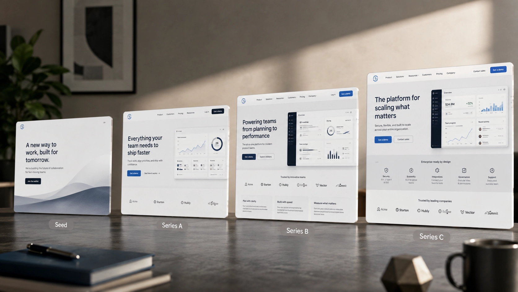
The useful way to think about this is as a progression rather than a checklist. Each stage asks the site to carry a different weight, and the mistake most companies make is either building for a stage they have not reached or staying at a stage they have long outgrown.
Seed
At Seed you are selling a view of the world. The product is early, the proof is thin, and the honest asset you have is clarity of thinking. The site should establish the problem sharply, explain the vision without drowning it in abstraction, show founder credibility, and offer one obvious conversion path. One. A Seed site with five competing calls to action has not decided what it wants. Resist the urge to build twelve pages you cannot yet fill with substance.
Series A
Series A is where the burden of proof arrives. You are no longer arguing that the problem exists; you are demonstrating that your solution works and that people pay for it. The site needs product-market evidence, real use cases, named customers where you have permission, and a differentiation story that survives contact with a comparison. The brand usually matures here too, moving from something assembled quickly to something deliberate. Buyers at this stage are running structured evaluations, and the site has to hold up under one. Stripe's overview of when to raise a Series A is a reasonable primer on what changes about the business at this point, and the website has to reflect the same shift.
Series B and C
By Series B and C the complexity is structural. You may have multiple products, several audiences, an enterprise motion alongside self-serve, procurement teams asking for security documentation, an integrations ecosystem, and a hiring push needing its own credible presence. The site stops being a set of pages and becomes an operation. Content has to be produced regularly, campaigns need landing pages that do not each look like a different company, and someone has to own it without filing engineering tickets for every change.
Treat this as a pattern, not a maturity model to be followed rigidly. Plenty of Series A companies sell to enterprise buyers from day one and need trust content early. Some Series B companies stay deliberately focused on one product. The stage is a guide to what usually changes, not a prescription.
Balance the investment narrative with the buyer journey
Here is the failure mode worth naming. After a raise, sites drift toward investor language. The homepage fills with market size, category creation and ambition, and the specifics a buyer needs quietly disappear. The company starts reading like a pitch deck anyone can open, which serves neither audience well.
Investors and buyers want different things from the same underlying truth. An investor is interested in the size of the opportunity, the wedge, the trajectory and the team. A buyer wants to know how it fits their workflow, what implementation looks like, what evidence exists that it works, and what could go wrong. Both readings can come from one strategic narrative. What you cannot do is tell two contradictory stories, or let the ambitious version crowd out the practical one on the pages buyers actually visit.
The structure carries most of this. A homepage can hold the wider ambition while product and use-case pages go deep on workflow and outcomes. A well-considered web design approach gives each audience the depth it needs without forcing everything into the first screen. Delve, a previous client whose branding, website and ongoing marketing design we handled, is a useful example. The rebuild centred on a sharper product story and enterprise-level proof rather than fundraising language, and the site went on to support a $32M Series A at a $300M valuation. The order matters: the proof came first, and the round benefited from it.
Turn growth into a coherent website system
Website scope expands with the company, and it expands faster than most teams expect. Product pages multiply. Use-case and industry pages appear because sales asked for them. Integration pages, customer stories, resource libraries, security and trust pages, careers content and campaign landing pages all arrive over a couple of years.
The question is whether they accumulate as disconnected requests or grow inside a system. Accumulation produces the site where four pages built by four people in four quarters look like four different companies. A system means those page types share a design language, a content model and consistent conversion logic, so a new industry page inherits decisions already made. Structured Webflow CMS collections make this practical, because case studies, integrations, articles and job listings become data you manage rather than pages you rebuild. Getting the information architecture right early is unglamorous, and it largely determines whether the site absorbs the next two years without a rebuild.
Use Webflow to protect speed after the raise
A funding round creates a surge of marketing work at the moment your engineering team is least available. Product roadmaps accelerate, hiring absorbs attention, and the last thing anyone wants is marketing queueing behind sprint planning to change a headline.
This is the operational argument for Webflow, and it is stronger than the usual no-code pitch. Modular components, structured CMS collections and reusable page patterns let a marketing team publish, test and iterate on its own. Campaign pages ship in hours. A new customer story is a CMS entry, not a ticket. The routine work stays out of the product backlog while brand consistency and build quality stay intact, because the system was designed with governance in mind rather than left open for anyone to improvise in.
Two honest caveats. First, this autonomy depends entirely on how the site was built; a poorly structured Webflow build creates the same bottleneck it was meant to remove. Second, no platform eliminates the need for technical support, since complex integrations, custom interactions and performance work still require someone who knows what they are doing. The realistic promise is that Webflow development done properly moves most routine marketing work off your engineers, not all of it. For a longer view, we have written about whether Webflow is the future of web design.
Design for the company that exists after the announcement
The deadline mentality is the enemy of a good fundraising website. A round is a beginning, not a finish line. In the months after it lands you will hire aggressively, ship features faster, push upmarket, and possibly enter a new segment or geography. The site has to absorb all of that.
Which is an argument for starting earlier than feels necessary. Positioning takes time to clarify. Customer proof needs permission, and permission takes weeks. Product visuals need the product in a presentable state. A build needs testing before traffic arrives. Teams that begin four to six weeks out make design decisions under deadline pressure and usually pay for them later. Teams that start earlier get a site that still works six months on.
This is also where a coherent brand identity earns its place. Credibility is partly a design impression formed before anyone reads a sentence, and a brand assembled hastily in the run-up to an announcement tends to look exactly like that.
Treat the website as an ongoing product
Companies that avoid the rebuild cycle share one habit: they treat the site as something that improves continuously rather than a project that finishes. New customer evidence goes up when approved. Positioning refinements reach the site within days. Campaigns get proper landing pages instead of repurposed ones. The site tracks the company instead of lagging a year behind.
That is the model we run with clients on retainer, and it is why we work as a specialist Webflow agency rather than a template or migration shop: senior strategy, UX, visual design, animation and Webflow development delivered as one connected service, at startup speed, for venture-backed B2B SaaS, AI and technology companies. Ergo, a company we currently work with, is the clearest example: strategy, design, new pages and Webflow development as an ongoing partnership as the product and go-to-market requirements change, rather than a single delivery followed by silence.
Earlier partnerships show the same pattern at different stages. With HockeyStack, a previous client, the emphasis was a clean, trust-first site meeting enterprise expectations at Series A scale. With WorkSpan, also a previous engagement, the work involved repositioning around a more sophisticated product narrative serving sales and partnership leaders.
The warning signs that a site has fallen behind are consistent. Messaging describes a company you no longer are. Sales spends calls filling information gaps the site should close. Marketing is blocked by engineering for routine changes. Landing pages have drifted apart visually. Enterprise buyers cannot find security or compliance content. And every strategic change seems to require another full rebuild. If several of those are true, the issue is not the design. It is that the site was built as an artefact rather than a system.
Frequently asked questions
Do investors actually look at a startup's website?
Often, though how much weight they give it varies enormously. Some read case studies and product pages closely; others rely almost entirely on the deck and conversations. The sensible approach is to assume an investor may arrive with no context and should not come away confused, without assuming the website will win or lose the round.
When should we start the website work before a funding announcement?
Earlier than most teams plan for. Positioning needs clarifying, customer proof needs approval, product visuals need producing and the build needs testing before traffic arrives. Starting a few weeks out means making structural decisions under deadline pressure, which is what produces a site needing replacement within the year.
Should the website be built around the investor narrative?
No. Market ambition can sit on the homepage, but the pages buyers visit need workflow detail, implementation clarity, outcomes and proof. One strategic narrative should be expressed differently for the two audiences rather than replaced by investor collateral, which tends to leave buyers without the information they came for.
What changes most between a Seed site and a Series A site?
Evidence. A Seed site can carry a clear problem, a credible vision and one conversion path. A Series A site has to demonstrate that the product works and that customers pay for it, with real use cases, named proof where you have permission and differentiation that survives comparison.
How do we avoid rebuilding the site at every round?
Build it as a system rather than a set of pages. A shared design system, a structured content model and consistent conversion logic mean new page types inherit existing decisions. Combined with continuous updates rather than periodic redesigns, that is what lets a site absorb years of growth.
Final word
A website will not raise your round. What it can do is make the company legible and credible to everyone who looks, so neither an investor nor a buyer has to work to understand what you do. The companies that manage this stop treating the site as something rebuilt under pressure every eighteen months and start treating it as infrastructure that grows with the business. If yours is already lagging behind the company you have become, get in touch and we can look at it with you.


.jpeg)