Designed for AI products selling to technical and enterprise buyers


What an AI website has to communicate in the first scroll
Before a visitor reads a single feature, your homepage has to answer three questions. Get them right and the rest of the page has somewhere to build from.
What does the product actually do?
The visitor should understand the use case before they have to decode the underlying technology. Lead with the job, not the architecture.
Why should I believe it works?
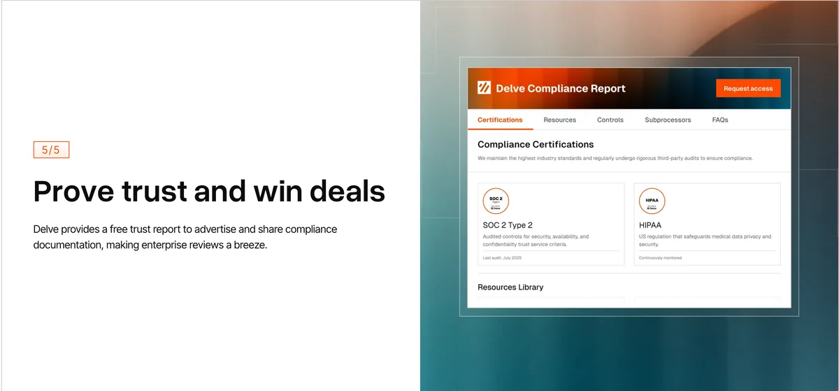
Product UI, customer proof, integrations, results and technical credibility should appear early, not halfway down the page.
Is this company mature enough to trust?
The visual system needs to make an early-stage product feel reliable, without pretending it is something it is not.
Every section below exists to answer one of those three questions faster and more convincingly than a technical evaluator expects.
Turning a technical AI product into a visual story
The hardest part of AI web design is not making the site look good. It is making a genuinely complex product understandable to two very different readers on the same page. Here is how we translate complexity into something people grasp quickly.
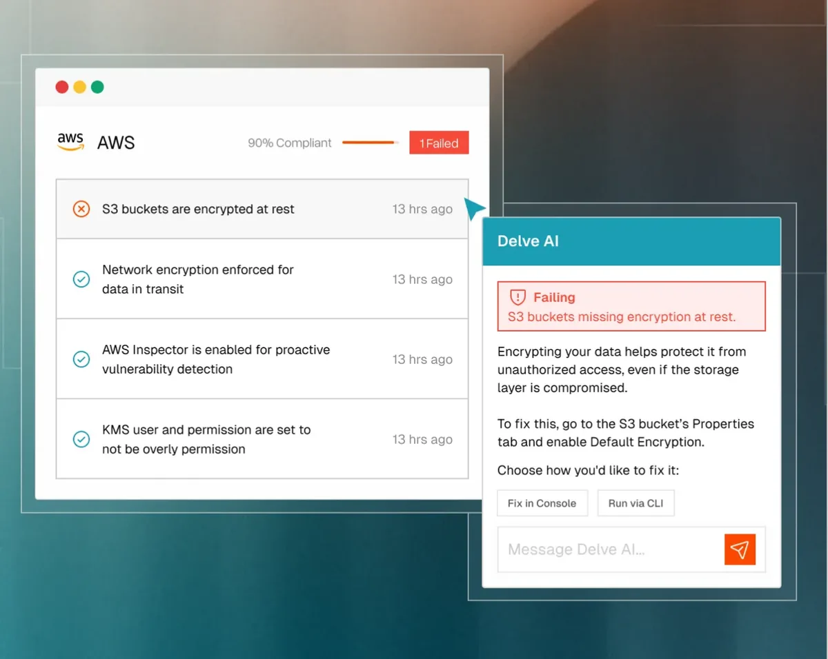
 Delve
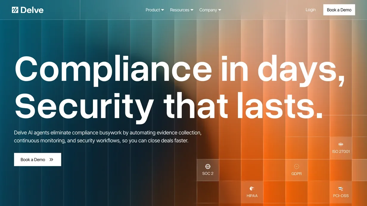
DelveProduct before technology
We lead with the job the product performs, not a paragraph about models, agents or infrastructure. The technical depth comes after the visitor knows why they should care.
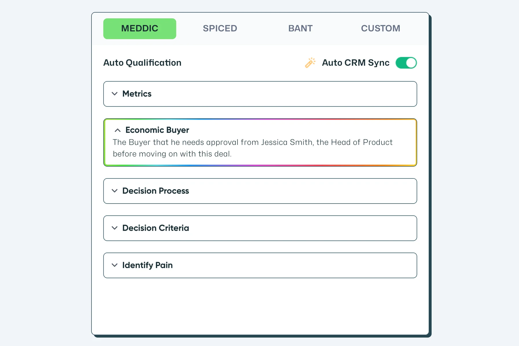
 Glyphic AI
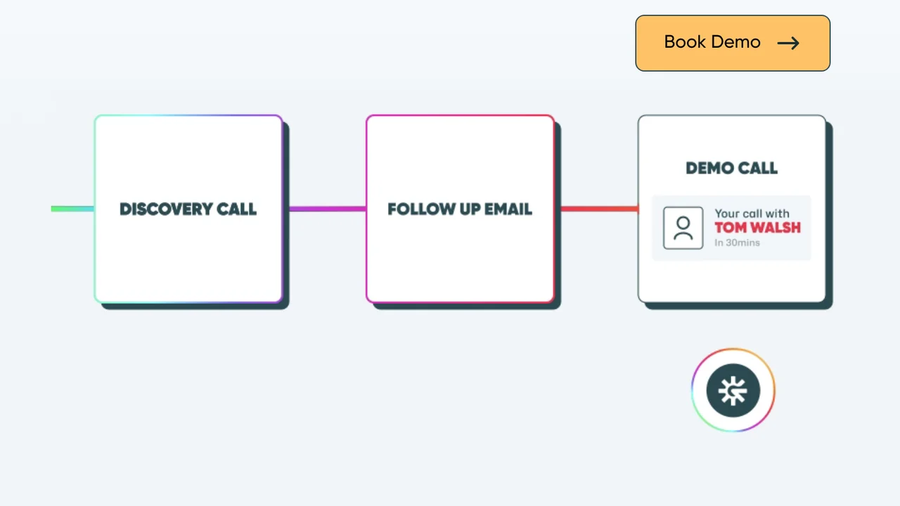
Show the workflow
Diagrams and product sequences explain what happens before, during and after the AI acts, so the product feels like a process a buyer can trust rather than a black box.
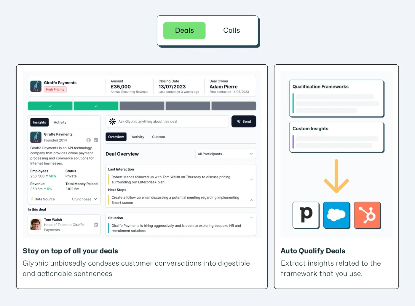
 11x
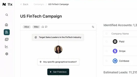
11xUse the real product
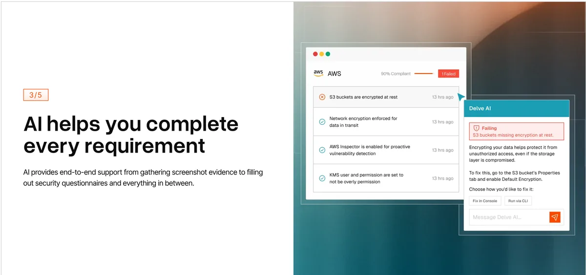
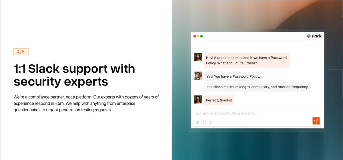
Product UI, screenshots and interactions carry more weight than generic AI illustration. Real interfaces prove the thing exists and works.
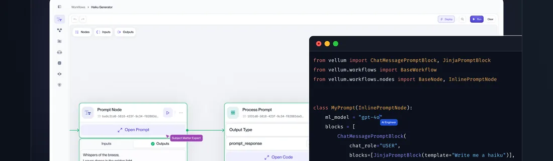
 Vellum
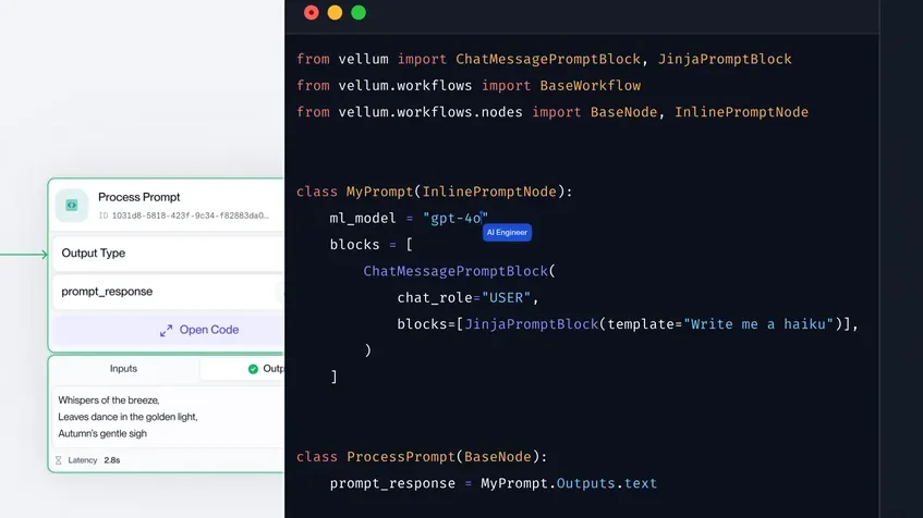
Design for two levels of understanding
A founder should grasp the page in 30 seconds, while a technical evaluator can go deeper without hitting a wall. We build both paths into the same layout.
Product UI is part of the website design
Most AI startup sites get product visuals wrong in one of two ways. They either hide the product completely behind vague promises, or they drop raw, unframed screenshots into the page with no context. Both cost you trust.
We treat the interface as a first-class design element:
- Clean and frame real product UI so it looks intentional, not pasted in
- Highlight the one action that matters instead of showing the whole dashboard
- Build short visual workflows rather than isolated screenshots
- Use animation only where it makes the product easier to understand
- Keep product visuals maintainable, so they survive the next interface change
Done well, product visuals do the selling for you. A framed sequence from a tool like Glyphic AI or Vellum shows a buyer exactly what they are getting, which is far more persuasive than another line of copy claiming it works.
Design that makes an early product look credible
You can have excellent technology and still lose a deal because the marketing site feels like an MVP. Buyers and investors read design as a signal of how serious the company is. We close that perception gap deliberately.
- Track record
$100M+
raised by clients
100+
websites delivered
15+ years
design experience
Typography and hierarchy
Dense technical information is made to feel deliberate and readable, not overwhelming.
Consistent visual language
Product UI, diagrams, illustrations and marketing components look like they came from one company, not five contractors.
Enterprise trust signals
Security, integrations, customers, technical proof and case studies are easy to find, because that is what enterprise buyers scan for first.
Investor-ready polish
The site looks capable of supporting the next stage of the company, a Series A raise and enterprise sales, rather than the stage it started in.
The result is a website that makes an early product look like a company worth betting on.

Client testimonial
“A super good-looking website with great page-speed metrics and very quick execution.”
AI product storytelling, Webflow development and performance-focused design for a technical sales platform.

The anatomy of a strong AI startup website
A strong AI or SaaS page is not a stack of sections. It is six components working together:
 1
1Clear category and value proposition
The visitor knows what you are and who it is for within seconds.
 2
2Real product proof
Actual UI and interactions, framed to show the product doing its job.
 3
3Workflow or use-case explanation
A visual sequence of what the AI does and when.
 4
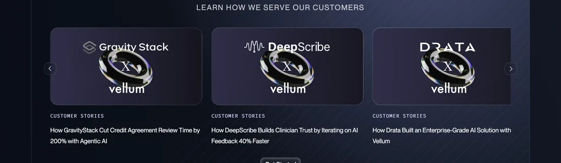
4Customer and company credibility
Logos, testimonials and results that a peer would recognise.
 5
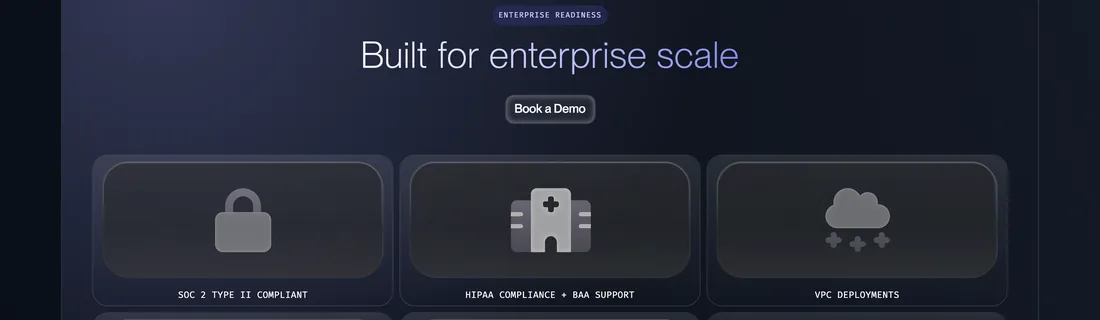
5Technical and enterprise trust
Security, integrations and documentation signals that pass a buyer's checklist.
 6
6One obvious conversion path
A single, clear next step rather than five competing buttons.
Designed to survive weekly product changes
A good AI website is not a set of one-off pages that break the moment marketing needs something new. It is a design system. AI companies publish constantly, so we design reusable structures for the pages you will keep needing:
Because these are built as modular Webflow components, your team can publish quickly and the pages still look like one coherent company. New pages inherit the system instead of starting from a blank canvas, which is what keeps a fast-moving site from turning into visual chaos six months in.
From design system to Webflow
Design only matters once it ships. Here is how we move from visual concept to a production site built to be edited.
- 01
Design in context
Pages are designed around real content, real product UI and responsive behaviour, not idealised mockups that fall apart with live data.
- 02
Figma when it helps
For teams with an existing product or brand design system, work can begin in Figma and carry that system straight through.
- 03
Webflow implementation
Reusable components, CMS architecture and responsive behaviour are built around future iteration, so the site is ready for the pages you have not thought of yet.
- 04
Custom interactions where they matter
We use custom code or animation when it helps explain the product, not to decorate the page.
See our dedicated Web design, Webflow development and Figma to Webflow service pages for how each part works in detail.
Performance is part of the design
A beautiful startup site is a failure if animation, video and oversized product visuals make it crawl. On AI sites especially, heavy product imagery is where speed quietly disappears. We treat performance as a design constraint, decided up front, not a cleanup task at the end.
- Optimised product imagery
- Controlled, purposeful animation
- Responsive asset delivery
- Clean Webflow implementation
- Core Web Vitals built into the design decisions
- Mobile-first QA
The point is simple: speed is designed in from the first layout, so the site that looks great also loads fast for the buyer evaluating you on their phone between meetings.
Selected AI
web design work


What we can design and build
AI and SaaS web design
Website strategy, UX and visual design for complex technical products.
Webflow development
Production-ready, scalable builds designed for marketing autonomy.
Figma to Webflow
Turn approved design systems into responsive Webflow websites.
SEO and AEO foundations
Technical, on-page and AI-search foundations built into the finished site.
AI startup website design
What should an AI startup website include?
At minimum: a clear category and value proposition, real product UI, a workflow that shows what the AI does, customer and technical proof, enterprise trust signals like security and integrations, and one obvious conversion path. The goal is for a visitor to understand the product, believe it works, and trust the company, all within the first scroll.
How do you explain a complex AI product visually?
We lead with the job the product performs, then use diagrams and product sequences to show what happens before, during and after the AI acts. Real product UI does most of the explaining, and the layout is built for two readers: a founder who wants the gist in 30 seconds and a technical evaluator who wants to go deeper.
Should an AI startup show product screenshots on its homepage?
Yes, but framed, not raw. Unstyled screenshots dropped into a page look unfinished and hurt credibility. We clean and frame the UI, highlight the single action that matters instead of the whole dashboard, and build short visual workflows. Showing the real product is far more convincing than describing it, as long as it is presented with intent.
How do you make an early-stage AI startup look enterprise-ready?
Through deliberate typography and hierarchy, a consistent visual language across product and marketing, and trust signals that enterprise buyers look for: security, integrations, customers and technical proof, all easy to find. The site should look capable of supporting the company's next stage without overstating what the product currently does.
How often should an AI startup redesign its website?
Most do not need a full redesign as often as they think. With a proper design system, you extend and update rather than rebuild. A full redesign usually makes sense at a major repositioning, a new funding stage, or when the current site clearly no longer matches the maturity of the product and the buyers you are now selling to.
Can you design around a product that changes every week?
Yes. We build a modular design system with reusable Webflow components, so feature updates, new use cases and fresh positioning slot into existing structures instead of requiring new one-off pages. The site stays visually consistent even when your product and messaging move quickly.
Do you design in Figma or directly in Webflow?
Both, depending on what serves the project. For teams with an existing product or brand system, we can start in Figma and carry it through. In many cases we design in context directly in Webflow, around real content and responsive behaviour, which avoids quality lost in handoff and gets you to a live, editable site faster.
Is Webflow good for a high-performance SaaS website?
Yes, when it is built properly. Webflow produces clean markup and fast load times, but performance on an AI site depends on how product imagery, video and animation are handled. We treat speed as a design constraint from the start: optimised assets, controlled animation and Core Web Vitals built into the design, not repaired at the end.



Make your AI product easier to believe in
Turn a complex technical product into a clearer, more credible and higher-performing website.
Get an AI website design teardown, covering homepage clarity, product presentation, trust signals, visual hierarchy and performance.